========================================================
#Load libraries
library(ggplot2)
library(lubridate)
library(dplyr)
library(tidyr)
library(gridExtra)
library(psych)

# Load the Data
data = read.csv('NYContributionData.csv', row.names = NULL)
#Convert dates from integers to DD-MM-YYYY format
data$contb_receipt_dt = dmy(data$contb_receipt_dt)
Univariate Plots Section
# Summarize the data set
dim(data)

## [1] 186976     18

names(data)

##  [1] "cmte_id"           "cand_id"           "cand_nm"
##  [4] "contbr_nm"         "contbr_city"       "contbr_st"
##  [7] "contbr_zip"        "contbr_employer"   "contbr_occupation"
## [10] "contb_receipt_amt" "contb_receipt_dt"  "receipt_desc"
## [13] "memo_cd"           "memo_text"         "form_tp"
## [16] "file_num"          "tran_id"           "election_tp."

str(data)

## 'data.frame':    186976 obs. of  18 variables:
##  $ cmte_id          : Factor w/ 24 levels "C00458844","C00500587",..: 7 7 7 7 7 7 7 7 7 7 ...
##  $ cand_id          : Factor w/ 24 levels "P00003392","P20002671",..: 12 12 12 12 12 12 12 12 12 12 ...
##  $ cand_nm          : Factor w/ 24 levels "Bush, Jeb","Carson, Benjamin S.",..: 19 19 19 19 19 19 19 19 19 19 ...
##  $ contbr_nm        : Factor w/ 44582 levels "AABO, TORBEN",..: 5418 2501 2505 2758 13532 13611 13611 3910 3912 40476 ...
##  $ contbr_city      : Factor w/ 1475 levels ""," BROOKLYN",..: 1062 907 164 907 597 91 91 907 1116 164 ...
##  $ contbr_st        : Factor w/ 1 level "NY": 1 1 1 1 1 1 1 1 1 1 ...
##  $ contbr_zip       : Factor w/ 34760 levels "","`1136","0",..: 30963 433 18042 2536 28006 23274 23274 7059 33689 20679 ...
##  $ contbr_employer  : Factor w/ 17710 levels ""," SPARTAN HEALTH SCIENCE UNIVERSITY",..: 3133 5841 4727 13900 14010 10897 10897 10897 13945 10897 ...
##  $ contbr_occupation: Factor w/ 8123 levels ""," ADMINISTRATIVE ASSISTANT",..: 5776 3359 6609 2936 4766 6561 6561 4896 583 4896 ...
##  $ contb_receipt_amt: num  50 250 50 50 12.5 10 10 50 31 15 ...
##  $ contb_receipt_dt : POSIXct, format: "2016-02-29" "2016-02-29" ...
##  $ receipt_desc     : Factor w/ 22 levels ""," SEE REATTRIBUTION",..: 1 1 1 1 1 1 1 1 1 1 ...
##  $ memo_cd          : Factor w/ 2 levels "","X": 1 1 1 1 1 1 1 1 1 1 ...
##  $ memo_text        : Factor w/ 131 levels ""," SEE REATTRIBUTION",..: 4 4 4 4 4 4 4 4 4 4 ...
##  $ form_tp          : Factor w/ 3 levels "SA17A","SA18",..: 1 1 1 1 1 1 1 1 1 1 ...
##  $ file_num         : int  1056899 1056899 1056899 1056899 1056899 1056899 1056899 1056899 1056899 1056899 ...
##  $ tran_id          : Factor w/ 186708 levels "A00136D649BB94F13985",..: 135800 137048 136618 136940 137691 136071 136209 136564 137978 143966 ...
##  $ election_tp.     : Factor w/ 4 levels "","G2016","P2016",..: 3 3 3 3 3 3 3 3 3 3 ...

levels(data$cand_nm)

##  [1] "Bush, Jeb"                 "Carson, Benjamin S."
##  [3] "Christie, Christopher J."  "Clinton, Hillary Rodham"
##  [5] "Cruz, Rafael Edward 'Ted'" "Fiorina, Carly"
##  [7] "Gilmore, James S IIII"     "Graham, Lindsey O."
##  [9] "Huckabee, Mike"            "Jindal, Bobby"
## [11] "Johnson, Gary"             "Kasich, John R."
## [13] "Lessig, Lawrence"          "O'Malley, Martin Joseph"
## [15] "Pataki, George E."         "Paul, Rand"
## [17] "Perry, James R. (Rick)"    "Rubio, Marco"
## [19] "Sanders, Bernard"          "Santorum, Richard J."
## [21] "Stein, Jill"               "Trump, Donald J."
## [23] "Walker, Scott"             "Webb, James Henry Jr."

summary(data)

##       cmte_id           cand_id                           cand_nm
##  C00577130:95454   P60007168:95454   Sanders, Bernard         :95454
##  C00575795:59789   P00003392:59789   Clinton, Hillary Rodham  :59789
##  C00574624:11764   P60006111:11764   Cruz, Rafael Edward 'Ted':11764
##  C00573519: 6614   P60005915: 6614   Carson, Benjamin S.      : 6614
##  C00458844: 4678   P60006723: 4678   Rubio, Marco             : 4678
##  C00579458: 2419   P60008059: 2419   Bush, Jeb                : 2419
##  (Other)  : 6258   (Other)  : 6258   (Other)                  : 6258
##                     contbr_nm         contbr_city    contbr_st
##  SWIRE, JAMES BENNETT MR.:   143   NEW YORK :55572   NY:186976
##  SWIRE, JAMES B. MR.     :   136   BROOKLYN :22940
##  PERE, RENE              :   120   BRONX    : 3720
##  FISHER, MICHAEL         :   115   ROCHESTER: 3083
##  DOWD, KATIE             :   113   BUFFALO  : 2339
##  DYCKMAN, MICHAEL MR.    :   107   ITHACA   : 2170
##  (Other)                 :186242   (Other)  :97152
##      contbr_zip          contbr_employer      contbr_occupation
##  108052128:   355   RETIRED      : 14464   NOT EMPLOYED: 24054
##  10024    :   235   NONE         : 14243   RETIRED     : 21165
##  10023    :   195   NOT EMPLOYED : 13272   ATTORNEY    :  6836
##  10025    :   189   SELF-EMPLOYED: 11155   TEACHER     :  4030
##  10128    :   186   N/A          : 10520   PROFESSOR   :  3274
##  11377    :   168   (Other)      :123176   (Other)     :127588
##  (Other)  :185648   NA's         :   146   NA's        :    29
##  contb_receipt_amt contb_receipt_dt
##  Min.   :  -5400   Min.   :2013-10-11 00:00:00
##  1st Qu.:     15   1st Qu.:2015-11-30 00:00:00
##  Median :     35   Median :2016-02-10 00:00:00
##  Mean   :    290   Mean   :2016-01-08 05:43:43
##  3rd Qu.:    100   3rd Qu.:2016-03-09 00:00:00
##  Max.   :4904861   Max.   :2016-03-31 00:00:00
##
##                      receipt_desc    memo_cd
##                            :184468    :178404
##  Refund                    :  1284   X:  8572
##  REDESIGNATION TO GENERAL  :   248
##  REDESIGNATION FROM PRIMARY:   246
##  REATTRIBUTION FROM SPOUSE :   145
##  REATTRIBUTION TO SPOUSE   :   145
##  (Other)                   :   440
##                                memo_text      form_tp
##  * EARMARKED CONTRIBUTION: SEE BELOW:90567   SA17A:178223
##                                     :87099   SA18 :  7469
##  * HILLARY VICTORY FUND             : 7368   SB28A:  1284
##  EARMARKED FROM MAKE DC LISTEN      :  251
##  REDESIGNATION TO GENERAL           :  248
##  REDESIGNATION FROM PRIMARY         :  246
##  (Other)                            : 1197
##     file_num                       tran_id       election_tp.
##  Min.   :1003942   A7A8C99C570A941E08F1:     2        :    49
##  1st Qu.:1056807   A8E6DF66C036B4EA89D5:     2   G2016:  1425
##  Median :1057425   C1013282            :     2   P2016:185499
##  Mean   :1056172   C1014914            :     2   P2020:     3
##  3rd Qu.:1066337   C1022783            :     2
##  Max.   :1066448   C1023143            :     2
##                    (Other)             :186964
The dataset contains 186,976 observations with 18 dimensions. There are
24 distinct Presidential Candidates to whom the contributions were made.
Majority of the number of contibutions were made to Bernard Sanders,
followed by Hillary Clinton and Ted Cruz. Mr. James Bennett Swire made
the most number of contributions. Those not employed and retired made
more contributions than contributors from any one particular occupation.
The average contibution amount was \$290, with a maximum of
\$4,904,861.
Let's first look at the distribution of the contributions amounts.
qplot(contb_receipt_amt, data = data, binwidth = 100000)
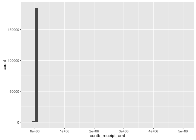
This plot does not give much information since the contribution range is very large. Since the median and mean contribution is \$35 and \$290, respectively, we can gain more insight by narrowing the range of the distribution between \$0 to \$1000.
qplot(contb_receipt_amt, data = data, binwidth = 50) +
      coord_cartesian(xlim = c(0,1000))
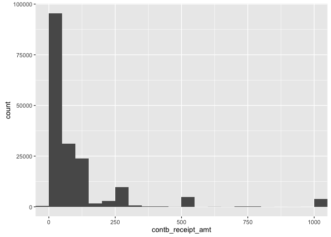
Even with this much smaller range, the dispsersion is quite large. By looking at this range, we can conclude that we have a right-skewed distribution.Another way to get a better understanding of contibution amounts is to transform the data using a log transform and narrowing our view to where majority of the values lie.
qplot(contb_receipt_amt, data = subset(data, contb_receipt_amt > 0),
      binwidth = 0.2) +
      scale_x_log10(breaks = c(10,100,1000,10000)) +
      coord_cartesian(xlim = c(1,10000))
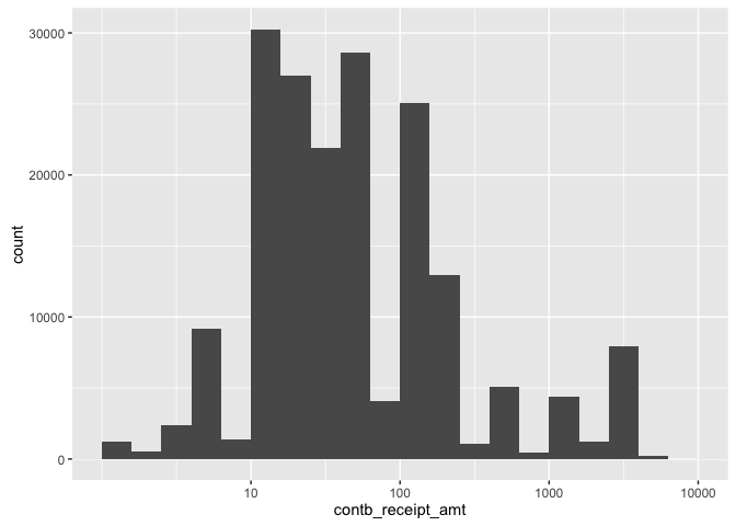
Although not perfectly normal, the log transformed plot is much less skewed.
Univariate Analysis
What is the structure of your dataset?
There are 186,976 observations in the dataset with 18 features:
Committee ID
Candidate ID
Candidate Name
Contibutor Name
Contributor City
Contributor State
Contributor Zip Code
Contributor Employer
Contributor Occupation
Contribution Receipt Amount
Contribution Receipt Date
Receipt Description
Memo Code
Memo Text
Form Type
File Number
Transaction ID
Election Type / Primary General Indicator
All of these are factors except for the Contribution Receipt Amount,
Contribution Receipt Date and File Number.
What is/are the main feature(s) of interest in your dataset?
The main features in the dataset are the Candidate Name and Contribution
Receipt Amount.
I am interested in seeing which candidate got the most and largest
contributions.
What other features in the dataset do you think will help support your
investigation into your feature(s) of interest?
Other features in the dataset that are of particular interest are the Contributor City and Occupation, and Contribution Receipt Date. I am interested in seeing if there are any recurring Contributor Occupations contributing to any particular candidate as well as the trends over time.
Did you create any new variables from existing variables in the dataset?
I did not create any new variables in the dataset.
Of the features you investigated, were there any unusual distributions?
Did you perform any operations on the data to tidy, adjust,
or change the form of the data?
If so, why did you do this?
I log-transformed the right-skewed Contribution Receipt Amount. I did this because I noticed that most of the values were very small (under \$100), but there were some values that extended well beyond \$1M and several values in between the \$100 and \$1M range. Log-transforming the data allowed me to see all the values in one graph, but this resulted in the refunded values being left out.
Bivariate Plots Section
Before looking into how the contributions are divided up amongst the
demographics and who they going to,let's first look at total
contributions to all candidates by date.
The following plot aggregates total contributions from all contributors
to all candidates by month.
#Subset data containing date and contribution amount columns only
date_cont_data = data[,c("contb_receipt_dt", "contb_receipt_amt")]
#Floor the dates to the first of each month
floored_data = date_cont_data
floored_data$contb_receipt_dt = floor_date(floored_data$contb_receipt_dt,
                                           "month")
#Aggregate the contribution amounts based on contribution date
agg_date_data = aggregate(contb_receipt_amt ~ contb_receipt_dt,
                          data = floored_data, FUN = sum)
ggplot(data = agg_date_data, aes(x = contb_receipt_dt,
                                 y = contb_receipt_amt)) +
        geom_line()
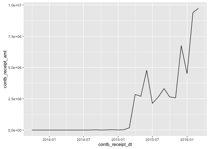
As one would guess, the total contributions have generally increased per month as we get closer to the election. Since the contritions made before Jan-2015 were minimal, it would be more appropriate to leave out the dates before Jan-2015.
ggplot(data = agg_date_data, aes(x = contb_receipt_dt,
                                 y = contb_receipt_amt)) +
  geom_line() +
  coord_cartesian(xlim = c(ymd("2015-01-01"), ymd("2016-03-01")))
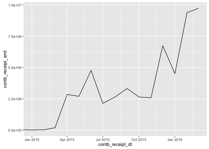
We see that overall trend is an increase in contributions with time,
with some dips in between. This is expected since we expect the
contributions will increase as the election approaches but each month's
contributions do not necessarily have t exceed the contributions made in
the previous months.
Next, let's see if there is any correlation in the contributions made to
the top 6 candidates.
#Subset data containing candidate name, contribution date and amount
cand_date_cont_data = data[,c("cand_nm", "contb_receipt_dt",
                              "contb_receipt_amt")]
#Floor the dates to the first of each month
floored_data = cand_date_cont_data
floored_data$contb_receipt_dt = floor_date(floored_data$contb_receipt_dt,
                                           "month")
#Aggregate the contribtution amounts based on candidate name
#and contribution date
agg_date_data = aggregate(contb_receipt_amt ~ cand_nm + contb_receipt_dt,
                          data = floored_data, FUN = sum)
#Subset the aggregated data for desired candidates
agg_date_subset_data = subset(agg_date_data, cand_nm %in%
                                        c("Sanders, Bernard",
                                        "Clinton, Hillary Rodham",
                                        "Cruz, Rafael Edward 'Ted'",
                                        "Carson, Benjamin S.",
                                        "Rubio, Marco", "Bush, Jeb"))
#Spread the candidate name across multiple columns
agg_date_subset_data_spread = spread(agg_date_subset_data, cand_nm,
                                     contb_receipt_amt)
#Remove the date column from the dataset
agg_date_subset_data_spread_date_removed =
                    subset(agg_date_subset_data_spread,
                    select = -c(contb_receipt_dt))
#Print correlation table
cor(agg_date_subset_data_spread_date_removed, use = "complete")

##                            Bush, Jeb Carson, Benjamin S.
## Bush, Jeb                  1.0000000         -0.20197318
## Carson, Benjamin S.       -0.2019732          1.00000000
## Clinton, Hillary Rodham   -0.5183566         -0.33024620
## Cruz, Rafael Edward 'Ted' -0.3429602         -0.21621087
## Rubio, Marco              -0.2978618          0.09202251
## Sanders, Bernard          -0.6198756         -0.28592116
##                           Clinton, Hillary Rodham
## Bush, Jeb                              -0.5183566
## Carson, Benjamin S.                    -0.3302462
## Clinton, Hillary Rodham                 1.0000000
## Cruz, Rafael Edward 'Ted'               0.8615447
## Rubio, Marco                            0.1278609
## Sanders, Bernard                        0.9250624
##                           Cruz, Rafael Edward 'Ted' Rubio, Marco
## Bush, Jeb                                -0.3429602  -0.29786181
## Carson, Benjamin S.                      -0.2162109   0.09202251
## Clinton, Hillary Rodham                   0.8615447   0.12786086
## Cruz, Rafael Edward 'Ted'                 1.0000000   0.10303551
## Rubio, Marco                              0.1030355   1.00000000
## Sanders, Bernard                          0.7630061  -0.15426850
##                           Sanders, Bernard
## Bush, Jeb                       -0.6198756
## Carson, Benjamin S.             -0.2859212
## Clinton, Hillary Rodham          0.9250624
## Cruz, Rafael Edward 'Ted'        0.7630061
## Rubio, Marco                    -0.1542685
## Sanders, Bernard                 1.0000000

#Generate correlation pairs graph
pairs.panels(agg_date_subset_data_spread_date_removed)
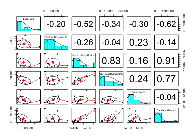
The largest positive correlation for the contributions is with Clinton
and Sanders. Since they are both Democrats, it may be that Democrat
supporters started donating to their favourite candidates at the same
time. Other significant positive correlations are between Clinton and
Cruz, as well as Cruz and Sanders.
Let's look at the contribution trends for Clinton and Sanders
individually in order to better understand the correlation between the
two.
#Subset data for desired candidates
data_subset = subset(data, cand_nm == c("Sanders, Bernard",
                                        "Clinton, Hillary Rodham"))
#Floor the dates to the first of each month
data_subset$contb_receipt_dt = floor_date(data_subset$contb_receipt_dt,
                                          "month")
#Group the data by candidate
date_candidate_groups = group_by(data_subset, contb_receipt_dt, cand_nm)
#Summarise data to get total contribution amount for each candidate
date_candidate_data = summarise(date_candidate_groups,
                                total_cont = sum(contb_receipt_amt))
g1 = ggplot(data = subset(date_candidate_data,
                          cand_nm == "Clinton, Hillary Rodham"),
                          aes(x = contb_receipt_dt, y = total_cont)) +
     geom_line()
g2 = ggplot(data = subset(date_candidate_data,
                          cand_nm == "Sanders, Bernard"),
                          aes(x = contb_receipt_dt, y = total_cont)) +
     geom_line()
grid.arrange(g1,g2,ncol = 1)
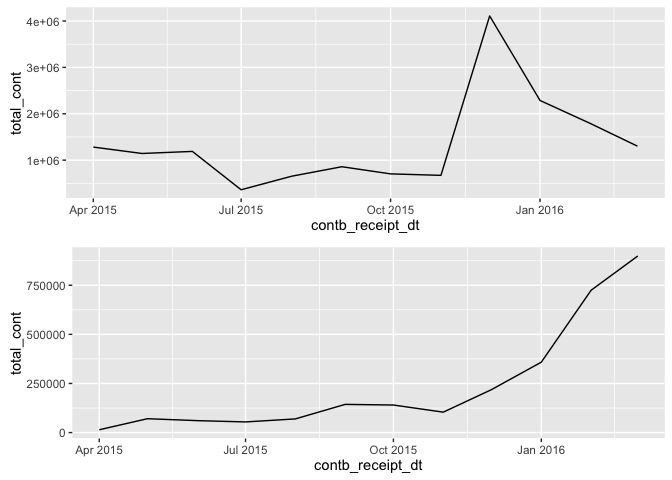
The large correlation between Clinton and Sanders is mainly driven by
the trends prior to Jan-2016.Around Jan-2016, the trends shift towards
having a negative correlation. Contributions for Sanders begin to rise
very quickly and begin to decrease for Clinton very quickly as well.
Next lets take a look at a scatterplot for contributions for Clinton and
Sanders.
#Spread the candidate name across multiple columns
date_candidate_data_spread = spread(date_candidate_data, cand_nm,
                                    total_cont)
#Assign names to each column
names(date_candidate_data_spread) = c("Date", "Clinton", "Sanders")
ggplot(data = date_candidate_data_spread, aes(x = Clinton, y = Sanders)) +
  geom_point()
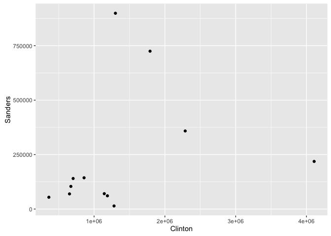
If the correlation between the 2 candidates was exactly 1, we would see
all the points fall in a straight line going from the bottom-left corner
of the plot to the top-right. In this case however, the points do not
fall on a straight line, but by looking at the plot, one can conclude
the relationship between the contributions made to Clinton and Sanders
has a positive correlation.
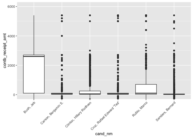
The following boxplots were plotted in order to get a better sense of
how the contribution amounts are distributed amongst the 6 candidates.
Also displayed below are the Interquartile Range for each candidate.
#Subset data for desired candidates
data_subset = subset(data, cand_nm %in% c("Sanders, Bernard",
                                          "Clinton, Hillary Rodham",
                                        "Cruz, Rafael Edward 'Ted'",
                                        "Carson, Benjamin S.",
                                        "Rubio, Marco", "Bush, Jeb"))
ggplot(data = data_subset, aes(x = cand_nm, y = contb_receipt_amt)) +
  geom_boxplot() +
  coord_cartesian(ylim = c(0,6000)) +
  theme(axis.text.x = element_text(angle = 45, hjust = 1))
print("Bush, Jeb")

## [1] "Bush, Jeb"

IQR(subset(data_subset,
           cand_nm == "Bush, Jeb")$contb_receipt_amt)

## [1] 2600

print("Carson, Benjamin S.")

## [1] "Carson, Benjamin S."

IQR(subset(data_subset,
           cand_nm == "Carson, Benjamin S.")$contb_receipt_amt)

## [1] 75

print("Clinton, Hillary Rodham")

## [1] "Clinton, Hillary Rodham"

IQR(subset(data_subset,
           cand_nm == "Clinton, Hillary Rodham")$contb_receipt_amt)

## [1] 225

print("Cruz, Rafael Edward 'Ted'")

## [1] "Cruz, Rafael Edward 'Ted'"

IQR(subset(data_subset,
           cand_nm == "Cruz, Rafael Edward 'Ted'")$contb_receipt_amt)

## [1] 75

print("Rubio, Marco")

## [1] "Rubio, Marco"

IQR(subset(data_subset,
           cand_nm == "Rubio, Marco")$contb_receipt_amt)

## [1] 675

print("Sanders, Bernard")

## [1] "Sanders, Bernard"

IQR(subset(data_subset,
           cand_nm == "Sanders, Bernard")$contb_receipt_amt)

## [1] 35
Because of the very large range of contribution amounts, the y-axis of
the above plot was restricted between \$0 and \$6,000. Also displayed is
the interquartile range for each candidate:
Sanders: \$35, Clinton: \$225, Cruz: \$75, Carson: \$75, Rubio: \$975,
Bush: \$2600
Bush by far has the largest interquartile range whereas Sanders, Cruz
and Carson are much smaller in comparison.
Next we explore contibution amounts based on occupations. The dataset
summary above tells us that most number of contribution came from those
not employed, retired, Attorneys, Teachers and Professors. Let's explore
the contribution amounts from those occupations.
#Subset data for desired occupations
data_subset = subset(data, contbr_occupation %in% c("NOT EMPLOYED",
                                                    "RETIRED", "ATTORNY",
                                                  "TEACHER", "PROFESSOR"))

ggplot(data = data_subset, aes(x = contbr_occupation, y = contb_receipt_amt)) +
  geom_boxplot() +
  coord_cartesian(ylim = c(-100,1000))
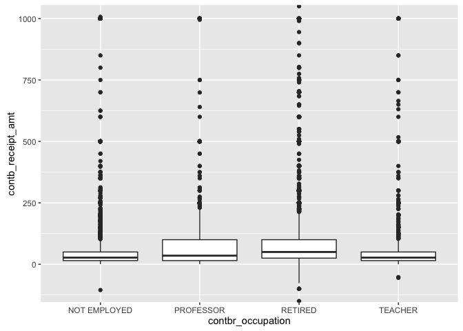
From the boxplot above, we can see that Professors had the largest
interquartile range. By visual inspection, it appears that the retired
demographic had the largest median as well as the most refunds.
It would be interesting to see who most of the contributions went to
from each of the above mentioned occupations and candidates.
#Subset data for desired candidates
data_subset = subset(data, cand_nm %in% c("Sanders, Bernard",
                                          "Clinton, Hillary Rodham",
                                        "Cruz, Rafael Edward 'Ted'",
                                        "Carson, Benjamin S.",
                                        "Rubio, Marco", "Bush, Jeb") &
                                        contbr_occupation %in% c("NOT EMPLOYED",
                                                                 "RETIRED",
                                                              "ATTORNY",
                                                              "TEACHER",
                                                              "PROFESSOR"))
#Group data by candidate and occupation
occupation_candidate_groups = group_by(data_subset,
                                       contbr_occupation, cand_nm)
#Get sum of contribution amount for each combination of candidate
#and occupation
occupation_candidate_data = summarise(occupation_candidate_groups,
                                      contsum = sum(contb_receipt_amt))
#Spread occupation into multiple columns
topcontdata = spread(occupation_candidate_data,
                     contbr_occupation, contsum)
topcontdata

## Source: local data frame [6 x 5]
##
##                     cand_nm NOT EMPLOYED PROFESSOR   RETIRED   TEACHER
##                      (fctr)        (dbl)     (dbl)     (dbl)     (dbl)
## 1                 Bush, Jeb           NA    3200.0  399274.3   8125.00
## 2       Carson, Benjamin S.           NA     350.0  257266.6   2697.00
## 3   Clinton, Hillary Rodham     338744.4  224731.8 1530139.2 162532.96
## 4 Cruz, Rafael Edward 'Ted'           NA    1950.0  326128.5   5940.00
## 5              Rubio, Marco           NA    4650.0  241481.6  16865.15
## 6          Sanders, Bernard    1351284.8  137505.9  182104.6 140516.64
Out of the 6 top candidates, Clinton and Sanders were the only 2 candidates to get contributions from all of the above mentioned occupations. Those not employed only contributed to either Clinton or Sanders.
Bivariate Analysis
Talk about some of the relationships you observed in this part of
the investigation. How did the feature(s) of interest vary with
other features in the dataset?
The first relationship that I observed in this part of the investigation involved looking at the contributions made by date. Unsurprisingly, the total amount of contributions trended positively with time. Other relationships that I observed in this part of the investigation involved how the contribution amount varied amongst the candidates and the amount that different occupations were contributing to the top candidates. It turned out that variation in the contribution amount was drastically different for Bush than it was for Sanders. In addition, it was interesting to see that those not employed only made contributions to Clinton and Sanders.
Did you observe any interesting relationships between the other
features (not the main feature(s) of interest)?
It was interesting to see that those not employed only made contributions to Clinton and Sanders who are both running as Democrats (out of the top 6). Those not employed made no contributions to any of the Republic candidates (out of the top 6).
What was the strongest relationship you found?
The strongest relationship I found was in contributions made to Clinton and Sanders. This relationship however, begins to break down after Jan-2016 and the trend begins to move in opposite direction for the candidates.
Multivariate Plots Section
Next we explore the sum of the contibution amounts for each of the top 6
candidates all on the same plot.
Note: the plot only displays contibutions between Jan. 2015 and Mar.
2016.
#Subset data for desired candidates
data_subset = subset(data, cand_nm %in% c("Sanders, Bernard",
                                          "Clinton, Hillary Rodham",
                                        "Cruz, Rafael Edward 'Ted'",
                                        "Carson, Benjamin S.",
                                        "Rubio, Marco", "Bush, Jeb"))
#Floor the dates to the first of each month
data_subset$contb_receipt_dt = floor_date(data_subset$contb_receipt_dt,
                                          "month")
#Group data by contribution date and candidate name
date_candidate_groups = group_by(data_subset, contb_receipt_dt,
                                 cand_nm)
#Get sum of contribution amount for each combination of date
#and candidate
date_candidate_data = summarise(date_candidate_groups,
                                total_cont = sum(contb_receipt_amt))
ggplot(data = date_candidate_data, aes(x = contb_receipt_dt,
                                       y = total_cont,
                                       color = cand_nm)) +
  geom_line() +
  coord_cartesian(ylim = c(0,1000000)) +
  coord_cartesian(xlim = c(ymd("2015-01-01"),
                           ymd("2016-03-01")))
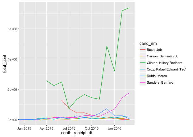
It's quite clear that contributions made to Clinton are much larger than
the rest of the candidates. Before we explore this particular
candidate in more detail, let's first look at the other 5 candidates in
a separate plot.
#Subset data for desired candidates
data_subset = subset(data, cand_nm %in% c("Sanders, Bernard",
                                        "Cruz, Rafael Edward 'Ted'",
                                        "Carson, Benjamin S.",
                                        "Rubio, Marco", "Bush, Jeb"))
#Floor the dates to the first of each month
data_subset$contb_receipt_dt = floor_date(data_subset$contb_receipt_dt,
                                          "month")
#Group data by contribution date and candidate name
date_candidate_groups = group_by(data_subset, contb_receipt_dt,
                                 cand_nm)
#Get sum of contribution amount for each combination of date
#and candidate
date_candidate_data = summarise(date_candidate_groups,
                                total_cont = sum(contb_receipt_amt))
ggplot(data = date_candidate_data, aes(x = contb_receipt_dt,
                                       y = total_cont,
                                       color = cand_nm)) +
  geom_line() +
  coord_cartesian(ylim = c(0,5000000)) +
  coord_cartesian(xlim = c(ymd("2015-01-01"),
                           ymd("2016-03-01")))
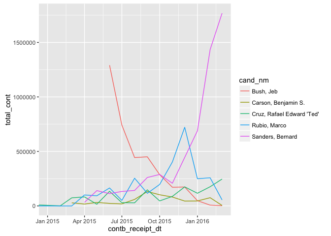
This plot now gives us a better view into the trend in contribution
amounts for the other candidates. The first 2 things that jump out
are:
1. Contribution amounts increasing at a very fast pace for Sanders
2. Contribution amounts decreasing at a very fast face for Bush
Contribution amounts for the other candidates seem to be relatively
stable except for a couple of really good months Rubio had towards the
end of 2015.
Since Clinton is an exceptional case, it may be worthwhile to dig a
little deeper into where her contributions are coming from.
Let`s first look at the summary of the data which contains only
contributions made to Clinton.
data_subset = subset(data, cand_nm %in% c("Clinton, Hillary Rodham"))
summary(data_subset)

##       cmte_id           cand_id                           cand_nm
##  C00575795:59789   P00003392:59789   Clinton, Hillary Rodham  :59789
##  C00458844:    0   P20002671:    0   Bush, Jeb                :    0
##  C00500587:    0   P20002721:    0   Carson, Benjamin S.      :    0
##  C00573519:    0   P20003281:    0   Christie, Christopher J. :    0
##  C00574624:    0   P20003984:    0   Cruz, Rafael Edward 'Ted':    0
##  C00575449:    0   P40003576:    0   Fiorina, Carly           :    0
##  (Other)  :    0   (Other)  :    0   (Other)                  :    0
##             contbr_nm            contbr_city    contbr_st
##  FISHER, MICHAEL :  115   NEW YORK     :26518   NY:59789
##  DOWD, KATIE     :  113   BROOKLYN     : 7339
##  TIDD, FRANCIS   :   93   BRONX        : 1254
##  NAZIR, MOHAMMAD :   90   ROCHESTER    :  710
##  RICHERT, RUTHANN:   85   BUFFALO      :  594
##  GRODY, GORDON   :   83   STATEN ISLAND:  504
##  (Other)         :59210   (Other)      :22870
##      contbr_zip                 contbr_employer
##  10024    :  191   N/A                  :10168
##  112012776:  157   SELF-EMPLOYED        : 8708
##  10025    :  143   RETIRED              : 2854
##  10011    :  129   INFORMATION REQUESTED: 1844
##  10128    :  125   HILLARY FOR AMERICA  :  940
##  100117200:  113   (Other)              :35272
##  (Other)  :58931   NA's                 :    3
##              contbr_occupation contb_receipt_amt
##  RETIRED              : 7265   Min.   :  -5400
##  ATTORNEY             : 3635   1st Qu.:     25
##  INFORMATION REQUESTED: 1935   Median :     50
##  LAWYER               : 1480   Mean   :    610
##  NOT EMPLOYED         : 1307   3rd Qu.:    250
##  (Other)              :44164   Max.   :4904861
##  NA's                 :    3
##  contb_receipt_dt
##  Min.   :2015-04-12 00:00:00
##  1st Qu.:2015-10-22 00:00:00
##  Median :2016-02-02 00:00:00
##  Mean   :2015-12-21 12:01:59
##  3rd Qu.:2016-03-03 00:00:00
##  Max.   :2016-03-31 00:00:00
##
##                                                            receipt_desc
##                                                                  :59176
##  Refund                                                          :  613
##   SEE REATTRIBUTION                                              :    0
##  * EARMARKED CONTRIBUTION: SEE BELOW REATTRIBUTION/REFUND PENDING:    0
##  REATTRIBUTION / REDESIGNATION REQUESTED                         :    0
##  REATTRIBUTION / REDESIGNATION REQUESTED (AUTOMATIC)             :    0
##  (Other)                                                         :    0
##  memo_cd                                     memo_text      form_tp
##   :52289                                          :51936   SA17A:51802
##  X: 7500   * HILLARY VICTORY FUND                 : 7368   SA18 : 7374
##            * EARMARKED CONTRIBUTION: SEE BELOW    :  255   SB28A:  613
##            *BEST EFFORTS UPDATE                   :   69
##            *                                      :   61
##            PARTNERSHIP--PARTNERS BELOW IF ITEMIZED:   27
##            (Other)                                :   73
##     file_num           tran_id      election_tp.
##  Min.   :1024052   C1013282:    2        :    0
##  1st Qu.:1056807   C1014914:    2   G2016:  992
##  Median :1057425   C1022783:    2   P2016:58797
##  Mean   :1054254   C1023143:    2   P2020:    0
##  3rd Qu.:1066337   C1024890:    2
##  Max.   :1066337   C1025546:    2
##                    (Other) :59777
Most of the number of contributions came from Zip Code 10024, which is
(unsurprisingly) a wealthy neighbourhood in Manhattan.
Below is a graph of the total contribution amounts made to Clinton by
city and split by occupation.
data_subset = subset(data, cand_nm %in% c("Clinton, Hillary Rodham") &
                       contbr_city %in% c("NEW YORK", "BROOKLYN",
                                          "BRONX", "ROCHESTER",
                                          "BUFFALO", "STATEN ISLAND") &
                       contbr_occupation %in% c("RETIRED", "ATTORNEY",
                                                "LAWYER", "NOT EMPLOYED"))
ggplot(data = data_subset, aes(x = contbr_city,
                               y = contb_receipt_amt,
                               color = contbr_occupation)) +
  geom_point()
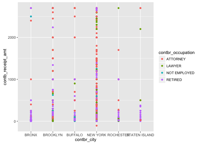
Generally, Lawyers and Attorneys tend to contribute larger amounts when
compared to those not employed and retired. New York City has the
largest dispersion with residents from Rochester and Staten Island
contribution relatively smaller amounts with a few outliers.
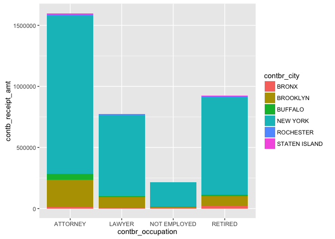
Below are 2 stacked column graphs that aggregate the data in the above
plot and present it in different views.
#Subset data for desired candidates
data_subset = subset(data, cand_nm %in% c("Clinton, Hillary Rodham") &
                       contbr_city %in% c("NEW YORK", "BROOKLYN",
                                          "BRONX", "ROCHESTER",
                                          "BUFFALO", "STATEN ISLAND") &
                       contbr_occupation %in%
                       c("RETIRED", "ATTORNEY", "LAWYER",
                         "NOT EMPLOYED"))
#Aggregate contribution amount for occupation and city
agg_data = aggregate(contb_receipt_amt ~ contbr_occupation +
                       contbr_city, data = data_subset, FUN = sum)
ggplot(data = agg_data, aes(x = contbr_city, y = contb_receipt_amt,
                            fill = contbr_occupation)) +
  geom_bar(stat = "identity")
ggplot(data = agg_data, aes(x = contbr_occupation,
                            y = contb_receipt_amt,
                            fill = contbr_city)) +
  geom_bar(stat = "identity")
From the first plot, it is quite apparent that most of the contribution
to Clinton's campaign came from New York City. Within New York City, the
largest proportion of those contributions were made by Attorneys,
followed by Lawyers and those retired.
The second plot has the occupations on the x-axis with the colors now
representing the city. From the fist plot, it was difficult to tell
whether more contributions were coming from Lawyers or those retired.
The second plot makes the answer to this question quite clear, showing
contributions coming from those retired exceeded the contributions from
Lawyers. The largest contributors however remain to be Attorneys.
By looking at both of the above plots, it can be concluded that largest
category of contributors were Attorneys from New York City.
Now let's go back to exploring the other candidates.
data_subset = subset(data, cand_nm %in% c("Sanders, Bernard",
                                          "Clinton, Hillary Rodham",
                                        "Cruz, Rafael Edward 'Ted'",
                                        "Carson, Benjamin S.",
                                        "Rubio, Marco", "Bush, Jeb"))
summary(data_subset)

##       cmte_id           cand_id                           cand_nm
##  C00577130:95454   P60007168:95454   Sanders, Bernard         :95454
##  C00575795:59789   P00003392:59789   Clinton, Hillary Rodham  :59789
##  C00574624:11764   P60006111:11764   Cruz, Rafael Edward 'Ted':11764
##  C00573519: 6614   P60005915: 6614   Carson, Benjamin S.      : 6614
##  C00458844: 4678   P60006723: 4678   Rubio, Marco             : 4678
##  C00579458: 2419   P60008059: 2419   Bush, Jeb                : 2419
##  (Other)  :    0   (Other)  :    0   (Other)                  :    0
##                     contbr_nm         contbr_city    contbr_st
##  SWIRE, JAMES BENNETT MR.:   143   NEW YORK :53679   NY:180718
##  PERE, RENE              :   120   BROOKLYN :22616
##  SWIRE, JAMES B. MR.     :   119   BRONX    : 3655
##  FISHER, MICHAEL         :   115   ROCHESTER: 3004
##  DOWD, KATIE             :   113   BUFFALO  : 2302
##  DYCKMAN, MICHAEL MR.    :   107   ITHACA   : 2157
##  (Other)                 :180001   (Other)  :93305
##      contbr_zip          contbr_employer      contbr_occupation
##  108052128:   299   NONE         : 14123   NOT EMPLOYED: 24042
##  10024    :   220   NOT EMPLOYED : 13241   RETIRED     : 19881
##  10025    :   185   RETIRED      : 13201   ATTORNEY    :  6537
##  10128    :   174   SELF-EMPLOYED: 10800   TEACHER     :  3988
##  11377    :   167   N/A          : 10475   PROFESSOR   :  3262
##  10023    :   163   (Other)      :118761   (Other)     :122988
##  (Other)  :179510   NA's         :   117   NA's        :    20
##  contb_receipt_amt contb_receipt_dt
##  Min.   :  -5400   Min.   :2013-10-11 00:00:00
##  1st Qu.:     15   1st Qu.:2015-12-08 00:00:00
##  Median :     35   Median :2016-02-11 00:00:00
##  Mean   :    279   Mean   :2016-01-10 20:23:45
##  3rd Qu.:    100   3rd Qu.:2016-03-09 00:00:00
##  Max.   :4904861   Max.   :2016-03-31 00:00:00
##
##                      receipt_desc    memo_cd
##                            :178403    :172403
##  Refund                    :  1200   X:  8315
##  REDESIGNATION TO GENERAL  :   218
##  REDESIGNATION FROM PRIMARY:   217
##  REATTRIBUTION FROM SPOUSE :   133
##  REATTRIBUTION TO SPOUSE   :   133
##  (Other)                   :   414
##                                memo_text      form_tp
##  * EARMARKED CONTRIBUTION: SEE BELOW:90544   SA17A:172126
##                                     :81022   SA18 :  7392
##  * HILLARY VICTORY FUND             : 7368   SB28A:  1200
##  EARMARKED FROM MAKE DC LISTEN      :  251
##  REDESIGNATION TO GENERAL           :  218
##  REDESIGNATION FROM PRIMARY         :  217
##  (Other)                            : 1098
##     file_num           tran_id       election_tp.
##  Min.   :1003942   C1013282:     2        :    19
##  1st Qu.:1056807   C1014914:     2   G2016:  1293
##  Median :1057425   C1022783:     2   P2016:179406
##  Mean   :1056396   C1023143:     2   P2020:     0
##  3rd Qu.:1066337   C1024890:     2
##  Max.   :1066425   C1025546:     2
##                    (Other) :180706
Based on the summary above, we will look at total contributions made to
the top 6 candidates for the following cities and occupations:
Cities: New York, Brooklyn, Bronx, Rochester, Buffalo and Ithaca
Occupations Not Employed, Retired, Attorney, Teacher and Professor.
data_subset = subset(data, cand_nm %in% c("Sanders, Bernard",
                                          "Clinton, Hillary Rodham",
                                        "Cruz, Rafael Edward 'Ted'",
                                        "Carson, Benjamin S.",
                                        "Rubio, Marco", "Bush, Jeb") &
                       contbr_city %in% c("NEW YORK", "BROOKLYN",
                                          "BRONX", "ROCHESTER",
                                          "BUFFALO", "ITHACA") &
                       contbr_occupation %in% c("RETIRED", "ATTORNEY",
                                                "NOT EMPLOYED",
                                                "TEACHER", "PROFESSOR"))
ggplot(data = data_subset, aes(x = cand_nm, y = contb_receipt_amt,
                               color = contbr_occupation)) +
  geom_point() +
  coord_cartesian(ylim = c(0, 6000)) +
  theme(axis.text.x = element_text(angle = 45, hjust = 1))
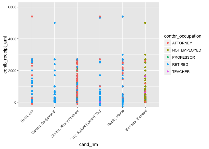
Note that the y-limits have been adjusted to ignore the refunded
contributions. For each candidate, except for Clinton, there appears to
be at least one outlier whose contributions are much larger than the
rest of the contribution amounts. Other than those few outliers, only
Clinton and Sanders seem receive fairly uniform contributions between
\$0 and \$3200.
Let's now turn our focus to aggregated contribution sums instead of
individual amounts as we saw above.
We first look at the contribution amounts to each candidate broken out
by city.
#Subset data for desired candidates
data_subset = subset(data, cand_nm %in% c("Sanders, Bernard",
                                          "Clinton, Hillary Rodham",
                                        "Cruz, Rafael Edward 'Ted'",
                                        "Carson, Benjamin S.",
                                        "Rubio, Marco", "Bush, Jeb") &
                       contbr_city %in% c("NEW YORK", "BROOKLYN",
                                          "BRONX", "ROCHESTER", "BUFFALO",
                                          "ITHACA") &
                       contbr_occupation %in% c("RETIRED",
                                                "ATTORNEY",
                                                "NOT EMPLOYED", "TEACHER",
                                                "PROFESSOR"))
#Aggregate contribution amount for candidate, occcupation and city
agg_data = aggregate(contb_receipt_amt ~ cand_nm + contbr_occupation +
                       contbr_city, data = data_subset, FUN = sum)
ggplot(data = agg_data, aes(x = cand_nm, y = contb_receipt_amt,
                            fill = contbr_city)) +
  geom_bar(stat = "identity") +
  theme(axis.text.x = element_text(angle = 45, hjust = 1))
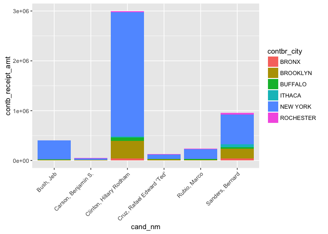
Once again, we see that having Clinton in the same plot makes it
difficult to analyze what is happening with the other candidates.
Since we have already explored Clinton's contribution data, it would
fine to remove her from the analysis going forward.
#Subset data for desired candidates
data_subset = subset(data, cand_nm %in% c("Sanders, Bernard",
                                        "Cruz, Rafael Edward 'Ted'",
                                        "Carson, Benjamin S.",
                                        "Rubio, Marco", "Bush, Jeb") &
                       contbr_city %in% c("NEW YORK", "BROOKLYN",
                                          "BRONX", "ROCHESTER", "BUFFALO",
                                          "ITHACA") &
                       contbr_occupation %in% c("RETIRED", "ATTORNEY",
                                                "NOT EMPLOYED", "TEACHER",
                                                "PROFESSOR"))
#Aggregate contribution amount for candidate, occcupation and city
agg_data = aggregate(contb_receipt_amt ~ cand_nm + contbr_occupation +
                       contbr_city, data = data_subset, FUN = sum)
ggplot(data = agg_data, aes(x = cand_nm, y = contb_receipt_amt,
                            fill = contbr_city)) +
  geom_bar(stat = "identity") +
  theme(axis.text.x = element_text(angle = 45, hjust = 1))
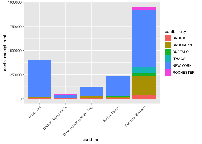
Much better! We now see that out of the 5 candidates presented, Sanders
has the largest total contribution amount, followed by Bush, Rubio, Cruz
and Carson in that order. For each of the candidates, we see that
majority of those contributions came from New York City, followed by
Brooklyn. Those 2 cities are really the only two that stand out and the
amounts become too small to determine the order thereafter.
Now let's look at the same type of plot but with the contribution
amounts broken up by occupation as opposed to city.
#Subset data for desired candidates
data_subset = subset(data, cand_nm %in% c("Sanders, Bernard",
                                        "Cruz, Rafael Edward 'Ted'",
                                        "Carson, Benjamin S.",
                                        "Rubio, Marco", "Bush, Jeb") &
                       contbr_city %in% c("NEW YORK", "BROOKLYN",
                                          "BRONX", "ROCHESTER", "BUFFALO",
                                          "ITHACA") &
                       contbr_occupation %in% c("RETIRED", "ATTORNEY",
                                                "NOT EMPLOYED", "TEACHER",
                                                "PROFESSOR"))
#Aggregate contribution amount for candidate, occcupation and city
agg_data = aggregate(contb_receipt_amt ~ cand_nm + contbr_city +
                       contbr_occupation, data = data_subset, FUN = sum)
ggplot(data = agg_data, aes(x = cand_nm, y = contb_receipt_amt,
                            fill = contbr_occupation)) +
  geom_bar(stat = "identity")
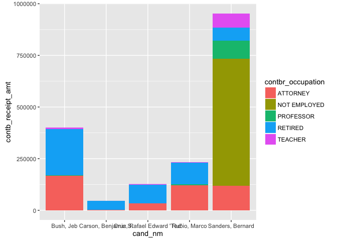
The total amount of contributions in this plot remains the same as the
prior plot. The difference is now the size of each colored chunk (which
now represents occupation instead of city) in the total stack for each
candidate. The story here is much less uniform than it was in the
previous case. Most of the contributions made to Sanders were by those
not employed whereas most of the contributions made to the other
candidates were by either those retired or Attorneys.
For the next part of the analysis, let's move our attention away from
the individual candidates and focus on the city and occupation only.
Keep in that although not explicity shown, the data is still being
filtered for the candidates, cities and occupations in the plots above.
#Subset data for desired candidates
data_subset = subset(data, cand_nm %in% c("Sanders, Bernard",
                                        "Cruz, Rafael Edward 'Ted'",
                                        "Carson, Benjamin S.",
                                        "Rubio, Marco", "Bush, Jeb") &
                       contbr_city %in% c("NEW YORK", "BROOKLYN",
                                          "BRONX", "ROCHESTER", "BUFFALO",
                                          "ITHACA") &
                       contbr_occupation %in% c("RETIRED", "ATTORNEY",
                                                "NOT EMPLOYED", "TEACHER",
                                                "PROFESSOR"))
#Aggregate contribution amount for candidate, occcupation and city
agg_data = aggregate(contb_receipt_amt ~ cand_nm +
                       contbr_occupation + contbr_city,
                     data = data_subset, FUN = sum)
ggplot(data = agg_data, aes(x = contbr_city, y = contb_receipt_amt,
                            fill = contbr_occupation )) +
  geom_bar(stat = "identity")
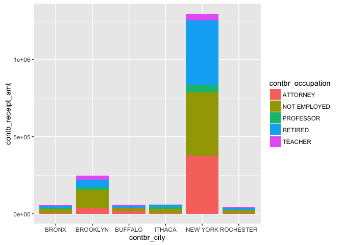
Once again we see that New York City outperforms all other cities by a
very large margin, with Attorneys alone contributing more than all other
cities. The likely cause of this is of course the fact that New York
City has a larger population than any of the other cities and further
work can include doing the same analysis on a per capita basis. Other
than the fact that Attorneys contribute large amounts, it is also
interesting to note the large presence of those not employed in each of
the cities.
Let's look at the same data again but with the occupation on the x-axis
and split out by city.
#Subset data for desired candidates
data_subset = subset(data, cand_nm %in% c("Sanders, Bernard",
                                        "Cruz, Rafael Edward 'Ted'",
                                        "Carson, Benjamin S.",
                                        "Rubio, Marco", "Bush, Jeb") &
                       contbr_city %in% c("NEW YORK", "BROOKLYN",
                                          "BRONX", "ROCHESTER", "BUFFALO",
                                          "ITHACA") &
                       contbr_occupation %in% c("RETIRED", "ATTORNEY",
                                                "NOT EMPLOYED", "TEACHER",
                                                "PROFESSOR"))
#Aggregate contribution amount for candidate, occcupation and city
agg_data = aggregate(contb_receipt_amt ~ cand_nm + contbr_city +
                       contbr_occupation, data = data_subset, FUN = sum)
ggplot(data = agg_data, aes(x = contbr_occupation, y = contb_receipt_amt,
                            fill = contbr_city )) +
  geom_bar(stat = "identity")
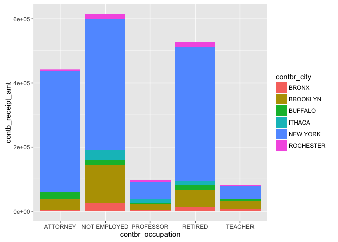
With New York City dominating in each of the colored stacked bars, it is still interesting to note that most of the contributions were made by those not employed, followed by those retired, Attorneys, Professors and Teachers in that order. From the previous chart it may have seemed like Attorneys were the top contributing occupation, but this plot proves otherwise.
Multivariate Analysis
Talk about some of the relationships you observed in this part of
the investigation.
The relationships that I observed in this part of the investigation
involved looking at the contributions made to each candidate as a
function of time and the aggregate contribution amounts broken up by the
city of the contributors and their occupations.
I also looked at the relationship between the contributors' cities and
occupations without consideration of which candidate they contributed
towards.
Were there any interesting or surprising interactions between features?
It was interesting to see the negative relationship in contributions
between Bush and Sanders as a function of time. As time progressed,
contributions made to Sanders went up very quickly and the opposite
effect happened for Bush.
It was also interesting to see that the top contributors were Attorneys
from New York City, but the overall top contributors were those retired.
I did not expected those retired to be ranking as the top contributing
group.
Final Plots and Summary
Plot One
#Extract contribution date and amount from data
date_cont_data = data[,c("contb_receipt_dt", "contb_receipt_amt")]
#Floor the dates to the first of each month
floored_data = date_cont_data
floored_data$contb_receipt_dt = floor_date(floored_data$contb_receipt_dt,
"month")
#Aggregate contribution amount by date
agg_date_data = aggregate(contb_receipt_amt ~ contb_receipt_dt,
data = floored_data, FUN = sum)
#Plot line graph
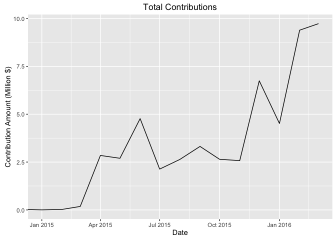
ggplot(data = agg_date_data, aes(x = contb_receipt_dt,
y = contb_receipt_amt/1e6)) +
geom_line() +
coord_cartesian(xlim = c(ymd("2015-01-01"),
ymd("2016-03-01"))) +
ggtitle('Total Contributions') +
xlab('Date') +
ylab('Contribution Amount (Million $)')
Description One
The total contribution amounts increase as a function of time, with each month generally outperforming the previous month's contributions, albiet with considerable volatility. The contributions really started pouring in after the 2015 new year and have continued their gradual increase since then.
Plot Two
#Set theme for plot
theme_set(theme_minimal(12))
#Plot boxplot
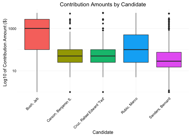
qplot(x = cand_nm, y = contb_receipt_amt, data = subset(data_subset, contb_receipt_amt>0),
geom = 'boxplot',
fill = cand_nm) +
ggtitle('Contribution Amounts by Candidate') +
xlab('Candidate') +
ylab('Log10 of Contribution Amount ($)') +
scale_y_log10() +
theme(legend.position = 'none') +
theme(axis.text.x = element_text(angle = 45, hjust = 1))
Description Two
We note that the range in contribution amounts varies quite a bit from one candidate to another. Bush seemed to have the largest median contribution amount with very few outliers. Sanders on the other had a very small IQR with many outliers on the higher end.
Plot Three
#Subset data for desired candidates
data_subset = subset(data, cand_nm %in% c("Sanders, Bernard",
"Clinton, Hillary Rodham",
"Cruz, Rafael Edward 'Ted'",
"Carson, Benjamin S.",
"Rubio, Marco", "Bush, Jeb") &
contbr_city %in% c("NEW YORK", "BROOKLYN",
"BRONX", "ROCHESTER", "BUFFALO",
"ITHACA") &
contbr_occupation %in% c("RETIRED", "ATTORNEY",
"NOT EMPLOYED", "TEACHER",
"PROFESSOR"))
#Aggregate contribution amount by candidate and occupation
agg_data = aggregate(contb_receipt_amt ~ cand_nm + contbr_occupation,
data = data_subset, FUN = sum)
#plot bar chart
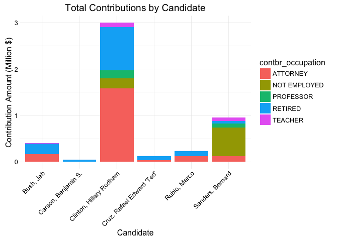
ggplot(data = agg_data, aes(x = cand_nm, y = contb_receipt_amt/1e6,
fill = contbr_occupation )) +
geom_bar(stat = "identity") +
ggtitle('Total Contributions by Candidate') +
xlab('Candidate') +
ylab('Contribution Amount (Million $)') +
theme(axis.text.x = element_text(angle = 45, hjust = 1))
Description Three
The largest group to contribute were Attorneys to Clinton. Clinton did get the most contributions out of all the other candidates. Another sizable group are those not employed contributing to Sanders.
Reflection
With many different features presented in the dataset, I had to only chose the ones that I believed would be the most interesting and would present us with the most insight into the financial contributions made the to 2016 Presidental Campaign. The central feature throughout most of this exploratory data analysis was the contribution amount. I was very curious to see which candidates got most of the contributions. After that, the rest of the analysis focused entirely on the top 6 candidates since the contributions made to the rest of the candidates were much less. I also wanted to know which occupation the contributors belonged to. Since there are many occupations in the dataset, I decided to focus only on the ones that showed up the most in the dataset. This helped to not clutter up the plots while still giving a strong indication of overall trends. Looking at the contribution amounts by date was also crucial since it gave insight into whether or not the campaigns were proving to be successful or not. The fact that the contributions for Sanders were consistently increasing with time and decreasing with time for Bush proved that Sanders was doing a much better job at campaigning than Bush. Narrowing in on the most top candidates, occupations and cities really helped reveal many insights. For future work, I would definitely consider looking beyond just the top 6 candidates, in addition to looking beyond the cities and occupations. I would also look at employers of the contributors to see if we can spot any trends in that feature.